Dye Sublimation

MarkBarbieri

Semi-retired
Joined
Aug 20, 2006
Have any of you made dye sublimation prints onto Aluminum? My wife and I were volunteering at an art festival last weekend and saw some really amazing looking prints on metal. I talked to the artist for a while and he explained that he made his with a dye sublimation printer onto specially coated aluminum. We have a dye sub printer at my wife's maker space, but I've only used it for things like fabric bags, mugs, and stuff like that. I've never tried to make real prints of pictures with it.

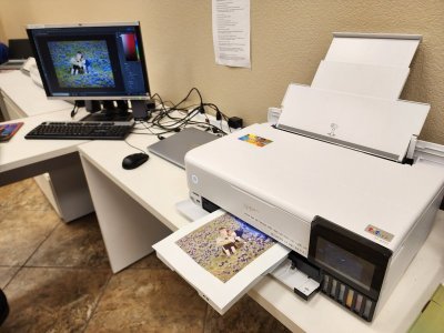
I ordered 8 cheap 8"x6" aluminum sheets and they arrived today. I'm going to go in tomorrow and try making some prints to see how the colors and tones come out. I tried finding some ICC profiles for the aluminum, but I couldn't find anything. We'll see how it goes without profiling. I think my printer profiler is so old that it is no longer supported and I'd really prefer not to buy a new one.

Here are the prints I think I'm going to start with. I wanted things that are very saturated, some human faces, at least one with a very a large monochromatic area, and lots of different colors.
IMG_20190721_064414-Edit.jpg

9T2A3813.jpg

9T2A2728-Edit-5.jpg

9T2A2229.jpg

_D3_2246-Edit.jpg

_D3_6571-Edit.jpg

_MG_5152-Edit-2-Edit-4.jpg_MG_9766-2-2.jpg
 
There are probably a group or two for this on Facebook. They have FB groups for almost every other kind of art imaginable. And there are lots of artists who love to share, get feedback, get and give inspiration and ideas to and from others and teach what they are excited about learning.
 
There are probably a group or two for this on Facebook. They have FB groups for almost every other kind of art imaginable. And there are lots of artists who love to share, get feedback, get and give inspiration and ideas to and from others and teach what they are excited about learning.
Good suggestion. I'll see if I can find something.
 
I did my test prints today. I learned a lot (which is a positive way of saying that I made a lot of mistakes).

  1. I forgot to reverse my images. It didn't really matter because there was nothing that looks "wrong" because it is backwards, like text. But it is a good thing to put on my checklist.
  2. I forgot to include space for bleed. I did my first one with an 8"x6" print onto a 8"x6" piece of aluminum. Of course, I didn't align it perfectly, so there is a bit that didn't get printed on. When doing stuff like this, it is best to print a little bigger than you need and accept that you'll lose a bit of your print. That's yet another reason to not crop perfectly when taking a shot but to shoot a little wider than you think you'll need.
  3. When using a heat press to transfer onto fabric, I always put down a silicon sheet, then my fabric, then my print, then a silicon sheet. It is important to have the print on the heated side of the heat press because otherwise the fabric will insulate the image preventing it from heating to the right temp. My problem was that the silicon sheet wasn't perfectly smooth and it imparted a faint pattern onto the prints. I think I'm going to get an extra sheet of aluminum to use between the silicon and the print. Why do we use the silicon sheets? I don't know. I was just told to do it that way and it isn't my heat press so I don't want to risk screwing it up.
  4. I did most of them by taping (with heat tape) the image over the blank. I figured out later that it is better to set the image on the printed sheet and tape it to that sheet. It makes alignment easier and you don't get a faint image of where the tape was on the print.

20230421_113207.jpg
The printer is an Epson ET-8550. I don't think that it is designed (or warrantied) as a dye sublimation printer, but it works for the purpose if you swap out the ink cartridges.

20230421_113757.jpg
This is the heat press I used. I read that you can get fast prints by pressing them for about 70 seconds at 400 degrees, but you'll get better prints if your press for 6 minutes at 325 degrees, so that's what I did.

20230421_121245.jpg
This is what a print looks like when it comes off the printer. It looks washed out before you press it.

20230421_123050.jpg
This is after I pressed the image. On the left is the sheet I printed on and on the right is the piece of aluminum with the image transferred onto it.

20230421_133058.jpg
This is the complete set of pictures. Overall, they came out OK. At first glance, they look great. When you look closely, you can see the pattern issue that I mentioned above. Also, there is a significant green cast to the pictures. I was hoping that it was just the lighting at the maker space, but it wasn't. I think I'm going to need to create an ICC profile and I'm not sure how I'm going to go about doing that. Also, the sunrise image in the top right looks bad because I tested oversaturating the image (which is what the artist told me that he did). I pushed it too far.

What's my goal? I'd like to do a collection of images mounted at different depths from a wall and backlight them with LED strips. I need to think more about it. They are definitely more eye catching than paper prints, but the gamut is more limited. I think it works well for some images and not others.
 

Attachments

  • 20230421_113207.jpg
    20230421_113207.jpg
    82.8 KB · Views: 0


I did some research into creating an ICC profile last night. For those not familiar with what I'm talking about, it's a profile that tells your computer how to adjust the colors and brightness of a print before sending it to a printer. The idea is that you color calibrate your monitor and then print with a color profile and your prints should match what you see on your screen. Of course, it will never be perfect because screens inherently look different than prints just like prints on matte paper look different from prints on glossy paper which look different from prints on metal. But the idea is to get close enough. The prints I made yesterday were not close enough.

To profile a printer, you print a bunch of squares of different colors and different brightness levels. Then you use a device that looks at each square and compares the color that the printer was told to print with the color that the printer actually printed. Then it builds a profile so that the next time you print, the colors will match as close as possible.

Usually, you read the printed squares with something like i1 Pro device. The downside to this approach is that their version that they describe as "an affordable, professional-level spectral color measurement solution including display and projector profiling and print quality assurance" costs $1,800. Maybe that's an OK price if you are running a printing business, but it is more than it is worth to me to solve the problem.

What I learned while researching it was that SilverFast has updated their scanning software to make printer profiles. For those not familiar with SilverFast, they make scanning software known for its ability to automatically detect and remove dust spots. I can buy a version of their software that will scan the prints with the colored squares for $175. Still a lot of money, but better than $1,800. And I won't need a scanner because my wife has one that will work with it. I suspect that it won't be as good as doing the profiling with a dedicated colorimeter, but it'll probably be close enough that I won't notice the difference.

So now I'm waiting to be inspired by the right project and the right amount of spare time to build my profiles and make new prints. That'll probably be a while.
 
Have no clue about this process but love those photos!

I've had a few metal prints done at mpix and the prints really pop.
 

GET A DISNEY VACATION QUOTE

Dreams Unlimited Travel is committed to providing you with the very best vacation planning experience possible. Our Vacation Planners are experts and will share their honest advice to help you have a magical vacation.

Let us help you with your next Disney Vacation!


facebook twitter
Top